RenovationHQ | How we designed our baby's nursery

Hi from Lizzy & Phil, husband and wife DIY duo from @renovationhq. We fell in love with a beautiful 1950’s house, but the building was deemed derelict. Despite this, we had a vision for this house, and with a lot of hard work we have turned it into the home we love and enjoy today.

We’ve done most of the work ourselves, from laying foundations right through to decorating. The house is a bit of a continuous work in progress, 6 years later we are still decorating rooms. The most recent project was our baby’s nursery, in anticipation for their arrival. Having never decorated a child’s room before I was nervous and excited all at the same time. The task was made a bit trickier by not knowing if we were expecting a boy or girl, so we had to try and keep the decoration fairly neutral. 

We knew we wanted to create a room with character, in a style in keeping with the rest of the house and with longevity for when the room might require another purpose in the future. With this in mind we agreed paneling the room would meet our objectives nicely. After looking at lots of different styles of paneling on Pinterest and Instagram we agreed creating standard shaker a third of the height of the room all the way round. This would look great and could be done cost effectively. By using 6mm thick MDF were able to achieve a flush finish to the skirting board which we had fit a couple of years earlier. To panel the whole room the cost was just under £100 and took about 5 days to finish including painting. 


Having decided on the style next on the list was to choose paint colours. Our colour palette for our house has predominantly been cooler tones of grey, white, blue and green, so we were always going to gravitate towards a similar tone. We decided a bluey-green could be paired well with more feminine colours, like pink, if we had a girl. Intuitively we felt we were having a boy which probably had an impact on the final colour scheme. We went with a bluey-green matt emulsion on the top half of the walls and an off-white on the paneling.  

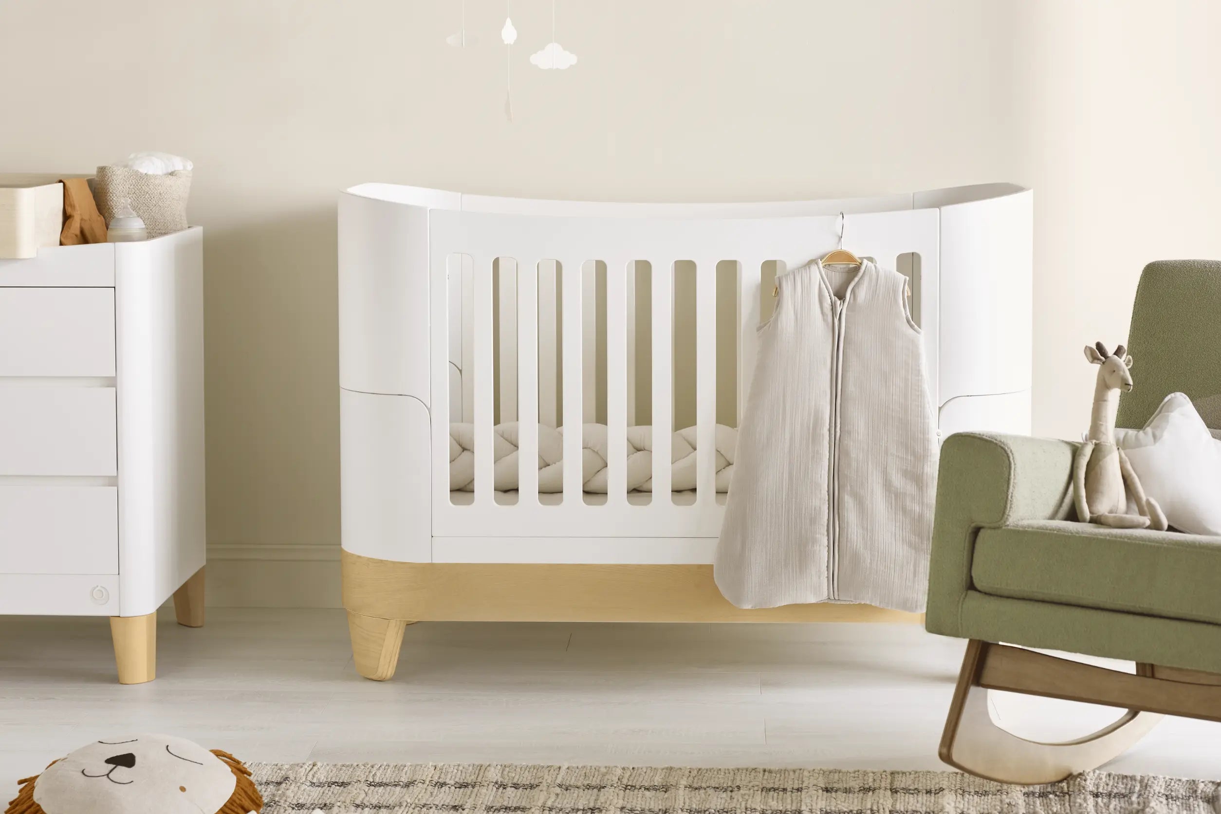
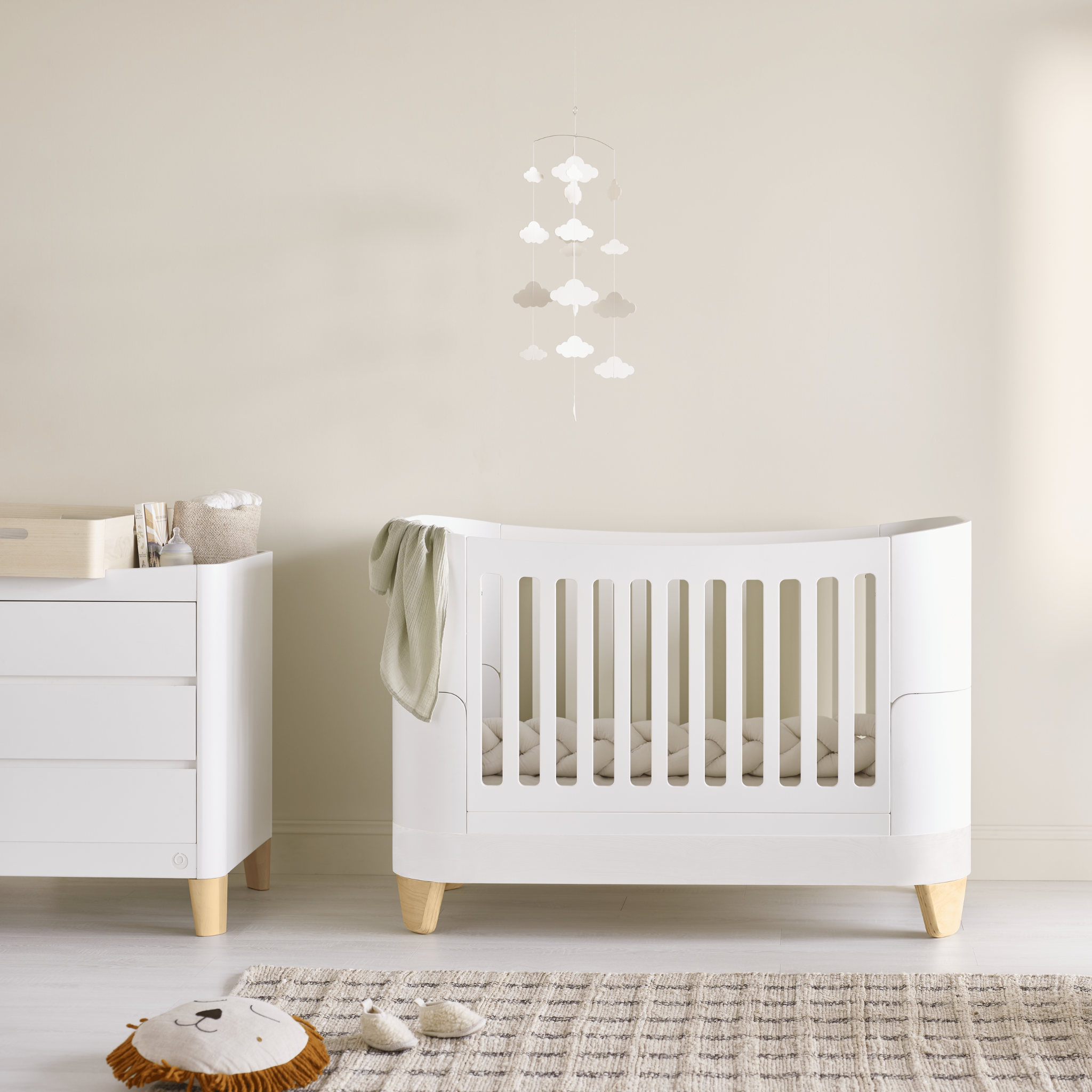
Having created the paneling and painted the room, next and most excitingly on the list was to choose nursery furniture. Gaia baby massively appealed to us not only due to the beautiful quality and aesthetics of the furniture but also because of the sustainable element of the brand. Not only are the products designed with longevity in mind lasting through different stages of your child's life (the cot can be adapted to suit each child from birth to 5 years old) and the products are also made where possible from renewable materials. They only work with suppliers and producers who manufacture in a sustainable way, so overall we felt Gaia’s values were coherent with our own. We are thrilled to collaborate with Gaia baby and have the complete sleep cot and Pink Serena Rocking Chair. Both of these products are beautifully made, and everything has been meticulously considered; be it the perfect height of the arms on the chair for feeding, or the pocket sprung mattress on the cot. The details in the products captured by the brand are really special and I can’t recommend them highly enough as a result. We are so happy with these products and they look beautiful in William’s nursery, the perfect complement to our happy home.